Sunday 28 April 2013

Walkthrough

I was asked by a client to make a walkthrough of a gallery space for them in 3D space. They had made a 2-screen film piece which they wanted screened in a gallery. They gave me detailed instructions on exactly how they wanted the ppiece to be screened in the space and it was my job to make sure that I built this in 3D so that they could send it off to various curators in order to better explain how their piece was to be screened. Visually this is a very rough piece of work but it does the job.

Here are some stills until I get the video uploaded:


Live Action Work


          I have been going through all my work making sure I have everything ready to upload onto my website and I came across the live action film I worked on last year. I actually worked on this along side the very same Ilektra Chrysanthou who I have been working with since, on all of my 3D projects.

This was a piece based on a story by Dan Bookham, about a boy with problems (to make a long story short). It was originally about a boy who was abused by his father as a kid. He was now all grown up and his father had just passed away. The young man now returned to his father's house as he was planning on selling it but upon returning he discovered items from his childhood which reminded him of the time his father was nice to him. It would make selling the house a difficult choice, one which he would now have to think about twice before going ahead with it.

In the end the story was still about an abused boy, but this time his father had died in the middle of the night. The boy was now faced with the question of whether he should stay in the house, where he knew he was safe, or go out into the real world.


The story may not have been brilliant but fortunately we had an adept cinematographer (Máté Vincze) and we managed to make the piece quite interesting visually.


Lighting and editing by Ilektra Chrysanthou and myself.

Monday 22 April 2013

Matte Painting

          One of the major things which is still incomplete is the establishing shot. Now, originally the idea was that everything took place inside this grand, floating city. As well as being an interesting idea in itself, it meant that I was able to build something very much out of the ordinary. After looking up hundreds of different takes ont he idea of a floating city, this is how our version of it has been evolving:

I started off with a VERY rough background which matched the general layout I wanted.


Adding in a quick Daylight system. (Note that the mrSun is actually illuminating the scene from the wrong direction when compared to the clouds)


Adding some basic textures to the scene.


Building more on what I have as well as introducing some new colours


I would have resumed the painting today but my mouse broke so Ilektra took over for a little bit and added some more cloud layers to the painting.


It's improving but still needs a lot of work. I need to add a few more details to the structures because it is looking too rough at the moment. I need to brighten up the scene in general and apply more textures to things. I will post an update on this once it is developed more.

Colour Correction

          Although this post suggests it is about colour correction it both is and is not...what I mean by this is that I am going to talk about reviewing your images or animations in the correct environment.

          Everything that we render might seem ok on our screens but ultimately the black and white information is computer black and white. As this is not something which will only be shown on computer screens in needs to be corrected to video black and white. Now that we have most of our shots I have been exporting them as image sequences to put into Avid Media Composer and review on a calibrated monitor with an external vectorscope. As expected our images did not look quite as bright as on our computer monitors. Below is an example of what our animation looked like on a calibrated monitor:

 Computer Screen


 Calibrated Screen


As you can see the result is not so pretty. We have been rendering things a little bit brighter in 3DS Max anyway but this is where the real calibration will have to take place. We found that with a little bit of desaturation the piece looks much nicer and helps to bring out the atmospheric smoke and particle effects. Of course this all sounds self evident but it is nice to be able to see your own work on a proper monitor because that is when you can start seeing the finished shots assemble piece by piece and find out exactly how the animation might look when screened.


Wednesday 17 April 2013

More Renders!


          Well I have officially never spent so much time on a project but at least it is going ok. By ok I mean I am managing to render things much faster now that I have created presets for the renderer. We have also had our compositor (Tiago Faria) start working on each shot. Unfortunately I do not have any stills from the compositing but I will post some as soon as possible. Below are snapshots from 3 more scenes:


          I am fairly happy with how the renders have been coming out although there are, of course, many things I wish I had the time to change. My main issue is that there are too many errors on the button machine. One of the major ones can be seen in the very first still above. The bump on the side of the machine seems quite extreme, no? But whilst the side of the machine is all 'bump-ed up' the rest of it seems very flat. The way teh bump is reacting seems very similar to how reflectivity might work on a material with a custom BRDF setting. For example at a 90 angle the material might be very reflective, while when looking at it head on it might not have any kind of reflectivity. The same seems to be happening with the bump and I am not sure as to why exactly. I will have to investigate further and ammend my lack of knowledge on this subject.

(Note: I am fully aware that the BRDF has got nothing to do with the bump map, I was simply comparing one to the other)

Monday 8 April 2013

Textures and Closeups


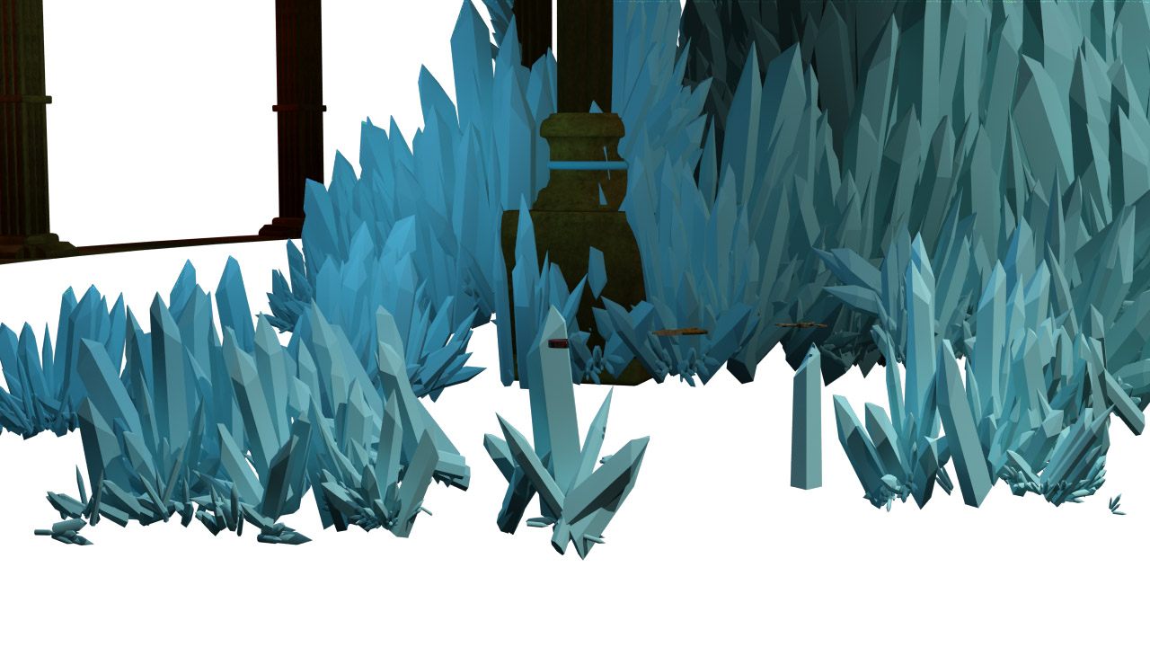
          Seeing as I did all the texturing for the environments I realised that I didn't actually have a post which looked closely at the texturing. I guess one of the reasons for this is that the button machine, cables machine and the workbench were the only things in the environment that will be seen from close so the aim was obviously to try and keep the resolution of the textures appropriate. So for this post I will mianly be looking at the textures used in those three machines while briefly going over some of the textures for the other machines/assets.


Below is a screenshot of the lower part of the button machine. I am very happy with how the body of the machine turned out, however there are several things I am not so pleased with. Most of the piping on this machine was textured using a single custom texture. For the corner pieces I just enabled the colour map and brightened up the material slightly. I think the colours work well with each other, however the corner pieces are too reflective. I should have definitely used a specularity map to make sure that only the brighter bits in the material reflect.


Next we have the actual button. I tried a few things with this button before deciding to leave it like this. The best result I could get out of it was if I made the texture about 60% reflective and about 50% glossy.

I am very pleased with how the bump worked out. I would normally apply an RGB Tint to the bump slot and copy the diffuse over, however that would mean if I wanted a REALLY subtle bump I would have to lower the settings way down. So instead I just copied the duffuse into the bump.


I then tried various intensities of self illumination. I was fairly certain from the start that this would not look so good because anything that is textured in this manner tends to lose all its details once illuminated.


So now lets look at a few renders of the workbench and the cables machine:

So as we can see the level of detail decreases as we go down the list. If we take a look at the workbench we can see that the blueprintsand most of the surfacing is a high-res texture. However if we look at the toolbox below the quality drops massively because this is something which will be seen only in wider shots so as long as there is suggestion of detail, the detail does not need to actually be there.


          With the last image I slightly overestimated the resolution of the texture that was required so you can see the difference between the sphere thing and the box thing it is on. So although this might look horrible, it will actually never be seen so it is enough to just have the very low-res texture in there.

          Finally, below is the unwrap for the rusty drawer underneath the workbench. Once again you can see that because this will not be seen the resolution of the texture I use drops massively. However I just wanted to experiment a little bit and make slightly better looking rust. I am very happy with the result considering I only used four colours - the 2 seen in the top right corner of the unwrap picture and two others as a faint background. It feels nice knowing I can paint something like what I want without having to immediately resort to finding textures online.


Sunday 7 April 2013

Assets: Power Machine


          I had a few renders of this machine up in an earlier post but I thought it would be best to get a few more renders and make a post dedicated to the actual machine. 

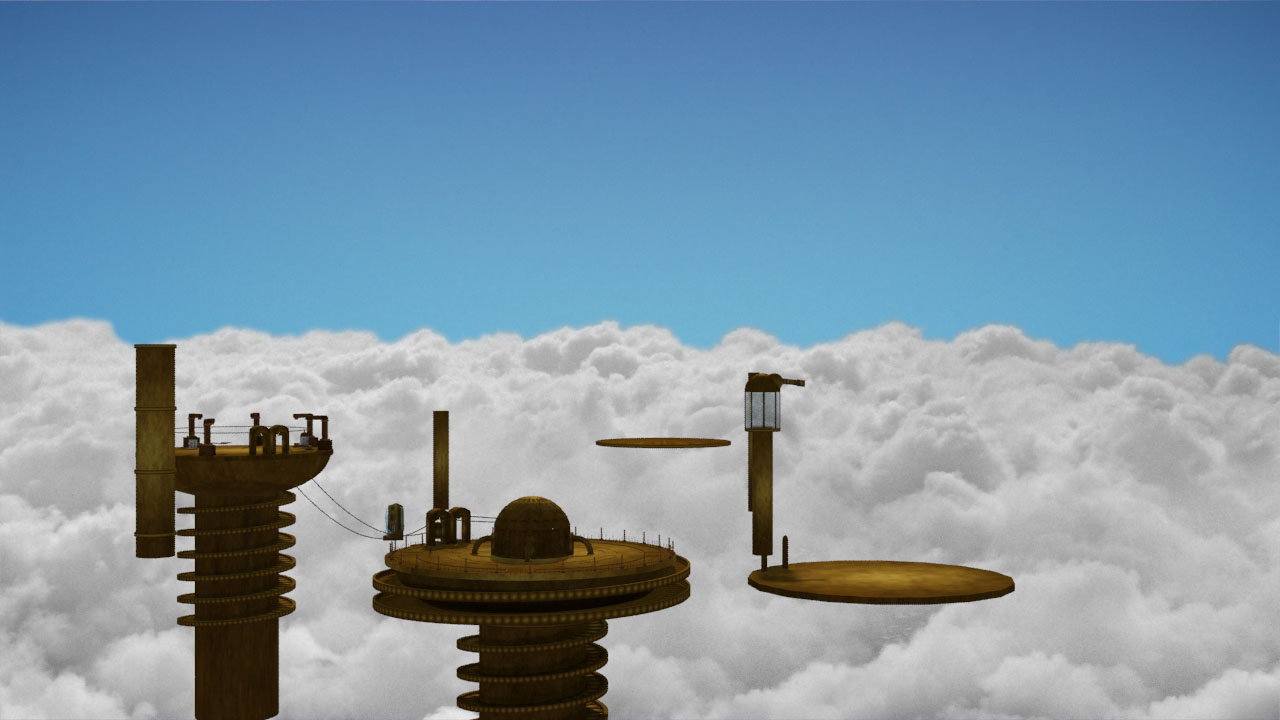
I was quite proud of the final result. Although the machine does not look that great in a closer shot, it does look grand and imposing when placed into the scene. When modelling this I tried to get it as close to the concept as possible; however, as we all know, a piece of concept art will never translate perfectly into its 3D counterpart.


          I actually didn't texture this machine really. By this what I mean is I didn't unwrap or paint any textures for it. All I used was an Arch & Design ProMaterials satined brass material and a light blue colour with self illumination for the glowy bits. I was planning on gradually texturing this machine however I decided against it because of the subtlety of the lighting on it.


          Below is a render of the machine inside the main space. It is really dark in egenral apart from a few highlights. I wanted to make it look very grand and imposing. This is why the simple ProMaterials textures worked so well on it.


First Renders


So after going through each finished shot and doing a test render, I got to the stage where I could start rendering out for real. The easist shots were rendered first. By this I mean shots which had no characters in. The next step after that was rendering shots in which the animaton was finished. Below are some screen captures of the renders. Note that these are lacking colour correction and any kind of atmospheric effects:


The characters were modelled and animated by Elektra Chrysanthou.

For more information on the characters visit: ilektraconceptart.blogspot.co.uk


Thursday 4 April 2013

Starting to render


          Although it's easter break, I have spent the last week running from computer to computer, setting up shots to render. At this stage I am still unsure whether the project will get finished on time, however I think the rendered shots are looking very nice, and that's without any form of ambient occlusion!


These are obviously draft renders (you can notice the lack of textures on some bits of the elektro primer).

The good thing is that most of the shots were easy to separate by foreground, middle ground and background. Some shots like the one I am about to explain below were an absolute nightmare to separate.

 Shot 6:

This was the first shot that I started rendering. I left the shot to render over the weekend (the studios are closed then) so that they would be done by Monday. It turns out that the shot still had 82 hours left on Tuesday afternoon. When I say I let the shot render I mean I just let it render with everything in the scene because I thought that 2 days would be plenty of time for it to be rendered. Without having a proper idea of how the shot would look rendered I set out rendering things by layers and this is how it went down:

 Background


Crystals


Workbench


Character "LL019"


Now because the character and the workbench were rendered separately from each other as well as the floor, I had to render them both together in order to JUST extract the shadows which I would later composite:

This:

in order to get this:

Last and by far the most important bit, was the foreground:


At this stage I was getting a lot of flicker in the render (I will go into this momentarily) and one of the things which was affected quite badly by this was the terminal machine, or at least parts of it so these I had to render out separately:


So after all that here is what the composited shot looked like:


The main problem which was avoided by doing this was render time and flickering. However what was actually wrong wiht the render was my stupidity. I had set the renderer to project FG points along the camera path. This changes the settings on the renderer so that it reuses final gather as well as geometry information. So instead of reducing the possibility of FG Flicker happening, I just made everything flicker. Also the crystals are floating because they are actually floating geometry which goes through the floor meaning that they had to be rendered together with the floor.

Separating shots into layers as I have is very helpful although I will definitely have to look much more into state sets so I can do this much quicker. Overall instead of taking 8 days to render (as it was estimated by 3DS) this shot only took a couple of hours.

Wednesday 3 April 2013

Blueprints - Update


     I thought it would just make more sense if I make another post about this rather than updating the previous one. 

          I went back to the blueprints and added the last few finishing touches. I think I may have spent too long on finishing this but I quite like the finished product. Below are the diffuse, bump and opacity maps. The bump will probably be used at the equivalent of 5% strength. I tried using a completely separate image for the bump map of the paper alone but it just didn't work. In the end the bump map makes the image looks a TINY bit nicer but is not really noticeable enough to matter too much. The key thing is that the blueprints get the point of the machine across - that it is basically a new way of creating electricity.


 I really wanted to make the blueprints look worn so as well as working more into the diffuse to give that effect I also did the obvious move of making an alpha/opacity map so the paper looks tattered and torn at the edges.


Instead of making a third post about this I will update this one once I have a render of the blueprints in 3D.

Blueprints


          As I mentioned earlier, I am working on the design for the blueprints which will be seen on the workbench. This is what I have so far:


          I was originally planning on using the images below and working into them to make them look like a blueprint:


          The reason I decided against this was not only because the above images are drawings and therefore not completely straight, but also because I had a great idea. This involved a simple screencap in 3DS Max. I opened each machine file separately and centered the machine after selecting every bit of it. Then all I had to do was change the viewport mode to Tech, under Stylized, and make a screen grab. The results can be seen below:


Button Machine


 Terminal Machine


Power Machine


          The tech views made my life so much easier because I don't know how long it would have taken me to make the blueprints out of my drawings. The best thing about these screen grabs is that they are screen grabs so no waiting for anything to render (also I would have had to change the renderer in order to have a tech view output).

          Overall I am not happy with the blueprint so I am certain it will have to undergo some major changes. Having said that though I am quit happy with the texture I have used for the background althoug I do feel that I need to work on the colour a little bit more.