Monday, 12 August 2013

Mitsubishi L200

Here are some renders of the finished product. I think the end result is ok for a first model but I do feel that there are quite a few improvements I could make on the model.

Wireframe Renders


Finished Renders


Sunday, 28 July 2013

Car Modelling (Cont.)

As you can see I have added more details to the car. I reworked the back a little bit and added in the handle for opening the boot. I also added in the rear wondow as well as the little lights on the left and right. I am currently working on the detail inside the boot as well as the door handles and the bottom of the car. The progress will be posted here


Next I added in the side mirrors and started working on the wheels.Here you can also see that I've added in the door handles and the mud flaps.


FIRST TEST RENDER

As the title of this picture suggests it is just a test renderbut I wanted to see roughly how this would look with some basic textures thrown on. Below is another test but from behind. This one is even worse because I forgot to smooth some areas, and actually added the wrong texture to others. But as I said, this is just a test and so far it is looking reasonable.


Sunday, 21 July 2013

Car Modelling

I have alwas.ys wanted to model a car. Ever since I started learning 3D I told myself that I would model once I had some free time. Seeing as I have now graduated I have just that - time to spend on modelling things.

I chose to model the Mitsubishi L200 (2005 model). The first challenge was the fact that I chose the 2005 version because it became increasingly more difficult trying to find some references. The reason I picked the car was because I didn't want to do a sports car as my first car. I wanted to get some practice so that when it came to modelling a sports car I would be able to do it to an acceptable standard. The pick up truck also has details which a lot of cars don't have, such as the detail on the underside and the suspension.

Here is how I started


 As I was modelling I wanted to quickly hide see what the whole shape would look like. So I mirrored one side over using the middle as the pivot and made it red and added to another layer. That way I could quickly toggle to see what car would look like as a whole.


When starting to work on the boot I had to start finding a reference for the rear so as you can see throughout my reference images on the left are constantly changing.


Here are some test renders I made as I went along. The first one still required a lot of work while the second images is a much more finished model


I will make new posts with the updates on the progress of the modelling

Thursday, 11 July 2013

Texturing Crates

I wanted to go something a little bit more basic than the stuff I have been doing so far and so I went ahead and started making some textures for a crate. This is where a lot of courses wtart from when teaching about unwrapping (or at least unwrapping a hard-surface model as it is infinitely easier than character unwrapping).

The secondary purpose of this exercise was to work a little bit on making degradation on textures and also to actually normal map something (for once!). What I had been doing up till now was using grunge brushes which gave me a pretty satisfactory result in a fairly short amount of time. However, I found a much more effective and much quicker method of creating wear. Before I go into detail let's look at the maps.

Here is the unwrap...very straight forward..


Here we have the diffuse texture:

The top right was actually the bottom of the crate so as you can't see I didn't both too much with adding anything to it.

Then based on that I made the specular and normal maps:


Because the crates were quite dark anyway I just needed to lower the levels a bit to ensure that they were not reflective at all. The middle crate on the left had that one sticker with the gear which I wanted to reflect a little bit of light so I desaturated it and upped the exposure. All in all there wasn't much going on here in terms of reflectivity and also because the signs would be relatively worn that would make things that were normally reflective, less so.


This was actually done using xNormal filters in Photoshop. This makes the process of normal mapping much simpler. Although bear in mind that I would not be able to use the same filter if I actually wanted to make some detailed normal map. I would have to actually model the high poly version.

So, here is the final result:


I'm not too happy with the normal mapping of the screws if I'm honest but then again it is a small detial so not something that can't be overlooked. I am very happy with the 'worn' look of the stickers and paint on the crates on the other hand although I should have dulled down the colours of the yellow sticker. Finally I really don't like the ambient occlusion and how noticeable it is on the bottom of the left most crate. When I say noticeable I mean it just looks dirty. It doesn not look like a contact shadow so that is definitely something I would have to change.

Tuesday, 9 July 2013

More plant/vegetation concepts

Here are some more concepts I had to draw out. Same as before, these have very basic detail in them and are more to represent the growth of the asset or how it would be found within the world within the game.

Phaseolus Coccineus:

This is actually completely domesticated in today's world, however I was asked to draw what the plant might look like in the wild. I found that IF this plant grew in the wild it would grow up rocks and mountains so this was my rough drawing of it.


Cedar Tree:

  There are actually many different types of cedar tree and the instructions were not so clear on which type of cedar tree to draw the concepts for so this was the final result; from seedling to full grown tree.


Friday, 5 July 2013

Architectural Visualisation

So I thought I would start modelling something which I could then texture and light. When I say something I mean my friend's student kitchen. I guess this isn't really architectural visualisation because I know exactly what the kitchen looks like. In fact I have been sitting in the kitchen while modelling it! I just wanted more practice modelling something from reference and staying accurate to the reference.


Unfortunately both the saves I had of this got corrupted for some unknown reason so below is the latest version that I had up until the point that it crashed. I will not be continuing with this as the amount of work I have done is too much to re-do.


Saturday, 29 June 2013

My 2013 Showreel

I realised that I had not actually posted this on here.

My 2013 Showreel

This is my latest showreel. Everything in there is from my graduation animation but I hope to change that soon. I am in the process of working on several 3D assets and one or two VFX shots which will aim to show my ability to use CG for compositing purposes.

Friday, 14 June 2013

Tomb - Momentum

I was asked by a dubstep composer to design an album art cover for his new EP called Momentum. I was pretty much given total control over the design. However, I thought it best to try and extract some kind of idea from the artist so that I could narrow down the end result of the design. After a brief conversation with the artist I found out that he was keen on seeing something that contained a 3D mesh or something related to soundwaves.

This was the first thing that came to mind:


The artist was surprisingly happy with this initial design so the changes that I went on to make were few. This was the next stage of the design:


Once again, the artist seemed pleased with this so the next stage was playing with the colours a little bit (mainly saturating them via painting over them), and adding the artist's name on there. After the name was approved I added in the album title and that was that. Below are the final two images in the process:


Sunday, 9 June 2013

Explosioooooooooooon!

I mentioned in a previous post that I would do a little breakdown of the explosion I had to work on in the animation so here it is. 

Rendering out the explosion was actually quite simple because all that needed to be done is to render out one of the city platforms and then that would be composited into the whole shot.


The first explosion was done using the modifier PBomb in Max. I set the target as the roof and animated the explosion. This is by far the easiest method, however it is not a very good one because it just breaks the polygons into pieces instead of performing voronoi fractures

The easiest solution to the above problem would be to use the fracture voronoi script and break the roof up before 'detonating' it. This is what I have done below. The impact point was broken into very small pieces. Then I added a mid section which would have larger pieces falling off. Lastly I added in the bottom of the roof where some chunks of it might fracture but not necessarily fly off. Below is the result
 I thought that instead of using just the voronoi result I would combine the two. Below is what the finished shot looks like:


Elektra put a lot more work into the clouds and Tiago Faria composited the smoke into the shot. We were all quite pleased with the end result.

Sunday, 26 May 2013

Re-modelling

          Seeing as I have desperately been trying to get my showreel ready I have been going over some of my older stuff so I could maybe go over it and make improvements. The first few things I found, which I thought would be the most fun to work on, were some chair designs I had made for my Casino project.

Here are the three chair designs I came across which I had used in the project:


I think they are all way too curvy, unnaturally smooth on places and the second design just doesn't make sense.

I have currently only remodelled two of the three so here is the end result:


 I am much happier with this re-model. I am not sure whether the front legs need changing as I am worried about their practicality...then again in the references I used there were many chairs which had that build so I suppose it can be left as it is. This chair just looked very unrealistic originally because of the way it had been smoothed. I did not know how to use smoothing groups or add resolution near corners so that the smoothing would give me sharper edges.


I feel that the second design now makes a lot more sense than before although the bits that connect the main body up to the back rest still seem a little strange.

Wednesday, 22 May 2013

Colouring previous concepts

Don't expect to see anything fantastic here, I just wanted to (very!) quickly go over some of the rough concepts I had for the environment assets and paint over them. As a quick reminder I will add the un-coloured version of each series of concepts. These are very rough but I wanted to add a bit of colour to them so they can look a little more 'finished'.


Friday, 17 May 2013

Re-touching

          We decided that it would be a good idea to continue working on the animation straight after our submissions. The only problem with that is that we had another submission the week after so we didn't have a huge amount of time. We mostly tweaked some bits of animation and moved a few things around. The only thing that could be considered a 'big' change would be the addition of a new shot, the evolution of which you can see below:

This was actually the wall onto which a pipe connected. Once I removed the pipe it actually looked like a door!

Gave it some art deco to make it fit in with the environment  inside. The structure which the 'door' is attached to was completely retopolised so that I could smooth it properly. I think I could have done a much faster job out of this if I just used smoothing groups instead of trying to create the perfect topology. On the plus side I can do a lot with this in mudbox now that the turbosmooth is baked onto the shape.


With the help of Elektra and Tiago this is what the shot looks like finished:


Sunday, 12 May 2013

Attention to detail and visual errors

          It is funny how many mistakes you might have in your animation but no one will notice! It was actually quite amusing asking people to tell us what was wrong with a certain shot only to realise that we were the only ones who were noticing the mistakes! This is kind of a given, of course, because we have been working on this non-stop for a long time. But sometimes it really does seem strange how some people dont even see missing textures...

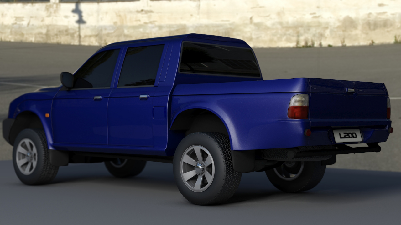
As you can see, by importing this shot into different computers to render I forgot to check that the textures had been processed properly. Basically what happened is that I had several textures with the same name but in different folders. In this shot, the specular map of the cables machine (the one behind the character) was used on the pipes of the button machine. I have learnt from my mistakes however and have started making sure that even if the files are in completely separate folders, that the names remain different.


Here I had the cogs inside the central machine (in the background) rendered separately along with the ambient occlusion. However I needed to re-render and did not have time in the end to composite the cogs on. But because the focus is on the characters (and the shot is extremely short) no one noticed.


Lastly, we have the closing shot of the film. This had several errors. The explosion consisted of two separate renders (I will make a separate post about this). We were very constrained by deadlines so I only had one night to make the explosion work. I was having some problems with MassFX meaning that the particles flew out too far off the screen, making the explosion seem too big. This was never picked up on.

Next, because the explosion was rendered separately, the lighting, for various reasons, was not 100% the same as it was in the original shot. This meant that just before the explosion happened you would be able to see the very obvious change in lighting.

Lastly, and this is by far the most obviously noticeable thing about the shot, is the fact that after the explosion happens the camera continues to track back for a second and a bit as we watch the smoke go up. We later decided that we needed to keep the smoke in there for a little longer but we did not have the time to re-render. Because of this the shot becomes a still (apart from the smoke). All th spinning platforms and moving cabins stop dead in their tracks. The beauty of it is that no one noticed anything!


The lesson that can be learnt from this is that attention detail can be key, however in most cases it is the one thing which can massively set a project back. If it is not noticed by someone else who has not seen the shot before, then it means that it is not something which you should spend hours worrying about.